Why I Included This Project
This project began with a casual conversation about dating apps that turned into a deeper discussion about user frustrations—superficial profiles, poor filtering, and a lack of compatibility. That moment inspired my first UX exploration: a Bumble feature redesign focused on building better connections.
As my first UX project, the design itself wasn’t perfect—but it laid the foundation for everything that followed. This case study reflects how I began applying design thinking beyond the classroom, conducting real user research, and learning through hands-on iteration. I include it not for polish, but to show curiosity, growth, and a willingness to learn.
Disclaimer: This case study is a personal project and the output is solely a work of my research and design.
Project Overview
This self-initiated case study explores a potential redesign of Bumble’s profile system by introducing customizable badges. The goal was to help users better express key preferences and values, making matches more intentional and conversations more meaningful.
My Role: UX/UI Designer, Researcher
Project Duration: 4 months
Problem
Many users on Bumble struggle to find compatible matches due to limited filtering options and surface-level interactions. This results in frustration, frequent unmatching, and a lack of meaningful conversations. For Bumble, this leads to decreased user satisfaction, lower engagement, and a risk of users abandoning the platform altogether—especially in competitive dating app markets.
Solution
Introducing the badge system would allow users to highlight key qualities and preferences, making profiles more informative and engaging. This would help users connect with more compatible matches and spark deeper conversations, enhancing the overall user experience on Bumble. The feature could increase engagement and user retention by providing a personalized, more meaningful matching process.
Research
To understand user behaviors and pain points, I conducted surveys and interviews with 16 Bumble users. The goals were to explore:
User Matching Experience: What does their matching process look like?
User Priorities: What qualities do users prioritize when searching for a match?
Premium Membership: Do users engage with Bumble’s premium membership?
Frustrations: What challenges do users face while using Bumble?
Key Findings
80% of users said they unmatched when there is a lack of meaningful conversation or perceived mismatch in value
What Users Care About Most:
Age
Attractiveness
Relationship type
Political views
Views on children
Premium Membership:
Only 20% of users reported actively using or having used Bumble's premium features.
User Painpoints
Difficulty Finding Compatible Matches
Users struggle to identify meaningful connections that align with their values and preferences.
Frustration with Shallow Conversations
Shallow interactions lead to user dissatisfaction, causing frustration and disengagement.
Desire to Share Key Information
Users want an easier way to share personal details and values that matter most to them, improving match compatibility
Personas and Empathy Map: Sloane
Personas and Empathy Map: Seb
Journey Map: Sloane

Sloane is looking for meaningful matches, but often gets frustrated by profiles that lack key details—like smoking habits or lifestyle compatibility. This journey map highlights her experience using Bumble and reveals opportunities for clearer filters and better profile customization.
Problem and Hypothesis
Problem:
Users struggle to find compatible matches because profiles lack clear, filterable information. Shallow matches lead to frustration and app abandonment.
Hypothesis:
If users can clearly display key values and lifestyle preferences on their profile using customized badges, they will be more likely to connect with compatible matches and experience more meaningful conversations, reducing frustration and app abandonment.
From Problem to Design Direction
Research showed that users often swipe through incompatible matches due to missing or overlooked profile details—like smoking preferences, political views, or pet ownership. These mismatches led to frequent unmatching.
To address this, I explored ways to surface important personal details earlier in the matching process—without requiring users to scroll through full profiles. The solution—User-selectable badges that summarize values, interests, and lifestyle choices at a glance.
Design Directions and Goals
Profile Badges: Allow users to highlight a personal value (e.g. “Wants kids,” “Non-smoker,” “Cat parent”).
Badge Filters: Let users filter potential matches based on selected badges.
Simplified Tag Selection: Ensure badge setup is fast and intuitive during onboarding or profile editing.
Non-intrusive Visual Design: Make sure badges enhance, not clutter, the existing Bumble profile UI.
Ideation Sketches
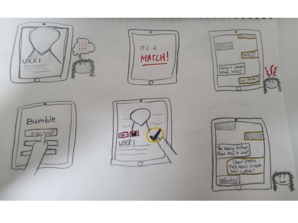


Lo-Fi Wireframes
In the ideation phase, I focused on redesigning a key feature of the Bumble app, aiming to keep the experience simple yet impactful. I started with the onboarding process, preserving many of the original components while introducing additional questions for users to answer. These new questions were designed to help foster more successful connections by capturing users' preferences and values, ultimately improving the match experience.

Introducing the filter tag
Based on key insights from user research, I identified an opportunity to improve Bumble’s matching process by introducing customizable “Compatibility Badges.” These badges highlight important values and lifestyle traits — like being a non-smoker, wanting kids, or owning pets — helping users filter matches and start more meaningful conversations.

Usability Study & Key Insights
I tested my redesigned feature with 13 users to evaluate how well the new tags and filters supported better matching on Bumble.
What Worked:
Residency Status Tag
70% believed it could help form better connections.
But over half felt uncomfortable sharing that kind of personal detail.
New Filter Tags
80% said they’d save time while browsing profiles.
60% felt the filters could foster more meaningful matches.
What Didn’t:
Less than half believed the filters would significantly improve their matching experience.
Many users expressed interest in free filters, but not in paying for premium features or add-ons.
Reflection and Key Takeaways
This project was my first step into UX design—and an important one. While the Bumble Badges feature was created with the intention of improving user compatibility, usability testing showed that it fell short of making a real impact. Users appreciated the idea, but it didn’t lead to deeper or more meaningful connections.
A user did point out that the concept of the badges was similar to the “Interest” section on Bumble, which reflects hobbies and passions. However, that section mostly reflects hobbies, not deeper preferences like relationship goals or lifestyle boundaries. This feedback highlighted an important realization: While the idea was promising, it wasn’t entirely novel and didn’t provide enough unique value to improve the matching process in a meaningful way.
Even though the final design didn’t fully solve the problem, it helped me grow in critical areas: conducting research, testing assumptions, and learning from failure. It reminded me that not every solution has to be perfect to be valuable—especially early in a designer’s journey. What matters is gaining insight, applying feedback, and continuing to improve with each iteration.