
AH-Ya
Project Overview: Ah-Ya is a mobile app that helps foreigners in South Korea find doctors who speak their language. By reducing language barriers in healthcare, it aims to improve access, trust, and communication between patients and providers.
My Role: UX Researcher, UX/UI Designer
Project Time: 4 months
Problem
Foreigners living in South Korea often face difficulties accessing healthcare due to language barriers. Currently, there is no dedicated app that helps users easily find doctors who speak their language. Most hospital websites are primarily in Korean and rarely indicate a doctor's language proficiency, resulting in communication challenges, delays in care, and added stress during critical health situations.
Goals
Create a user-friendly, multilingual app that helps users:
Search for doctors who can speak their language
View detailed doctor profiles, including clinic information
Easily book, manage, and review appointments
Why It Matters
South Korea’s growing foreign population—driven by global employment, education, and family relocation—faces major obstacles in navigating local healthcare systems. While medical care is highly advanced, the lack of accessible, multilingual support creates stress and confusion for non-Korean speakers. This often leads to miscommunication, delayed treatment, or the need to rely on unverified online sources and interpreters.
Ah-Ya aims to fill this gap by providing a dedicated, user-friendly platform that connects foreigners in Korea with language-compatible doctors and clinics—ensuring a more informed, respectful, and comfortable healthcare experience.
Research
User Interviews
I interviewed 25 foreigners living in South Korea to understand their healthcare experience in South Korea.
Key Insights:
Distance and language support was their top concern when finding a doctor in South Korea.
Over 60% relied on word-of-mouth to find an English speaking doctor.
Over 70% had had issues with communication while seeking medical treatment in South Korea.
Competitive Analysis
To understand the gaps in existing tools, I analyzed three commonly used platforms: Naver/Kakao Maps, Facebook expat groups, and ExpatHealthSeoul.com.
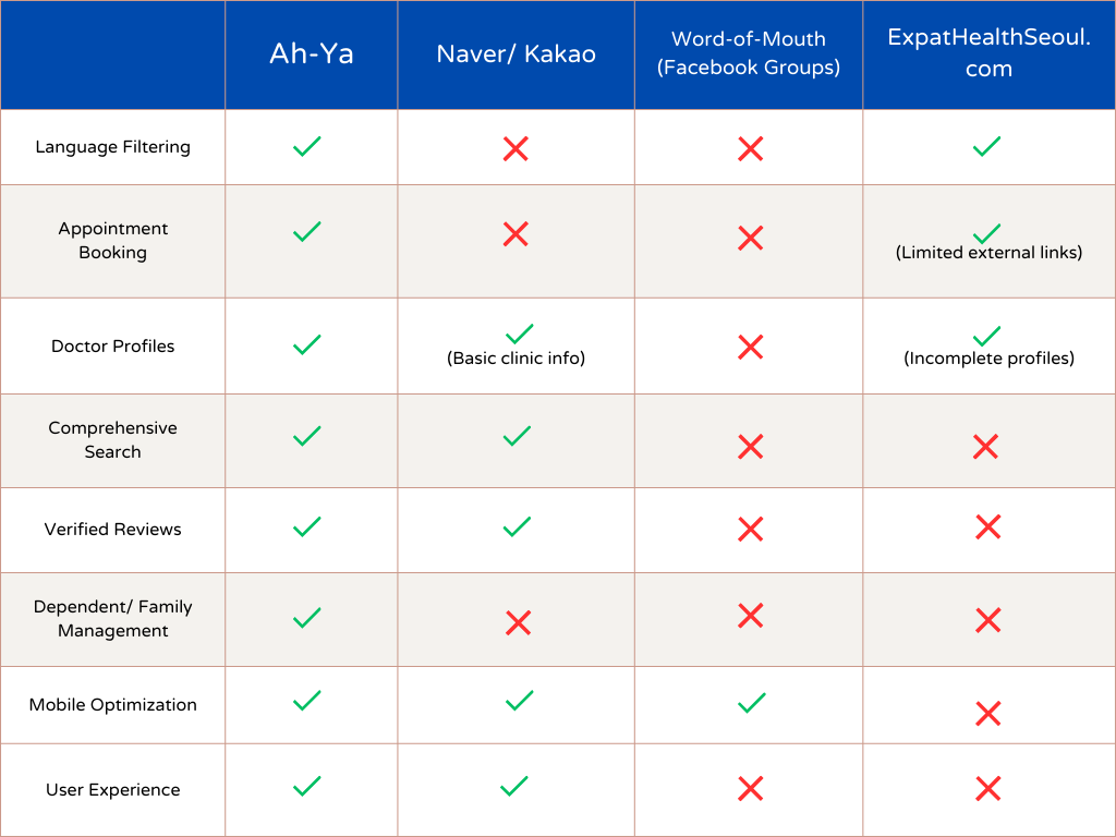
While each platform provides partial solutions, they often lack filtering options, verified reviews, or easy-to-use booking systems. My app, Ah-Ya, is uniquely positioned to address these gaps with a mobile-first design focused on multilingual access, verified reviews, and simplified appointment booking.
How Ah-Ya Stands Out
Ah-Ya is designed specifically for non-Korean speakers seeking healthcare in South Korea. Unlike existing tools, it offers fully translated doctor profiles, language filtering (English, Chinese, Japanese), verified reviews, and direct appointment booking—all in one mobile-first experience.
Personas
Why These Personas?
I created two personas—Sam and Adam—to reflect common, but distinct user groups among foreigners in Korea. Sam represents solo professionals with limited Korean who often face anxiety navigating healthcare. Adam reflects family-oriented users with dependents, highlighting the need for multilingual access and efficient appointment systems. These personas helped ground my design process in real-world needs and use cases.
User Journey Map

This journey map illustrates Sam’s experience using the Ah-Ya app to find an English-speaking doctor. It helped identify pain points in traditional healthcare platforms and informed design decisions that focus on accessibility, trust, and ease of use.
Problem and Hypothesis
Problem:
Foreigners in South Korea faced significant challenges when accessing medical care due to language barriers, cultural sensitivity, and a lack of centralized, multilingual doctor listings. Current platforms don’t guaranteer language compatibility or booking ease, leading to confusions, delays and anxiety—especially in urgent or sensitive situations.
Ah-Ya addresses this by connecting users with doctors who speak their language.
Hypothesis:
If users can search for doctors by languages spoken, view complete clinic profiles, and book appointments within one app, they’ll feel more confident and less stressed navigating Korean healthcare.
From Problem to Design Direction
Understanding the frustrations of navigating healthcare in a foreign country shaped the core goals of Ah-Ya’s design. My solution focused on building trust, accessibility, and simplicity for users who may feel overwhelmed or overlooked by Korean-language medical platforms.
Key design directions inspired by this problem:
Language filtering to match users with doctors who speak English, Chinese, or Japanese.
Clear, verified clinic profiles with essential information like photos, hours, and services.
Streamlined appointment booking without the need for Korean phone calls.
Family/dependent management for users booking care on behalf of others.
Culturally sensitive interface that feels intuitive and welcoming to a global audience.
The Design Process: Lo-Fi Wireframes
-

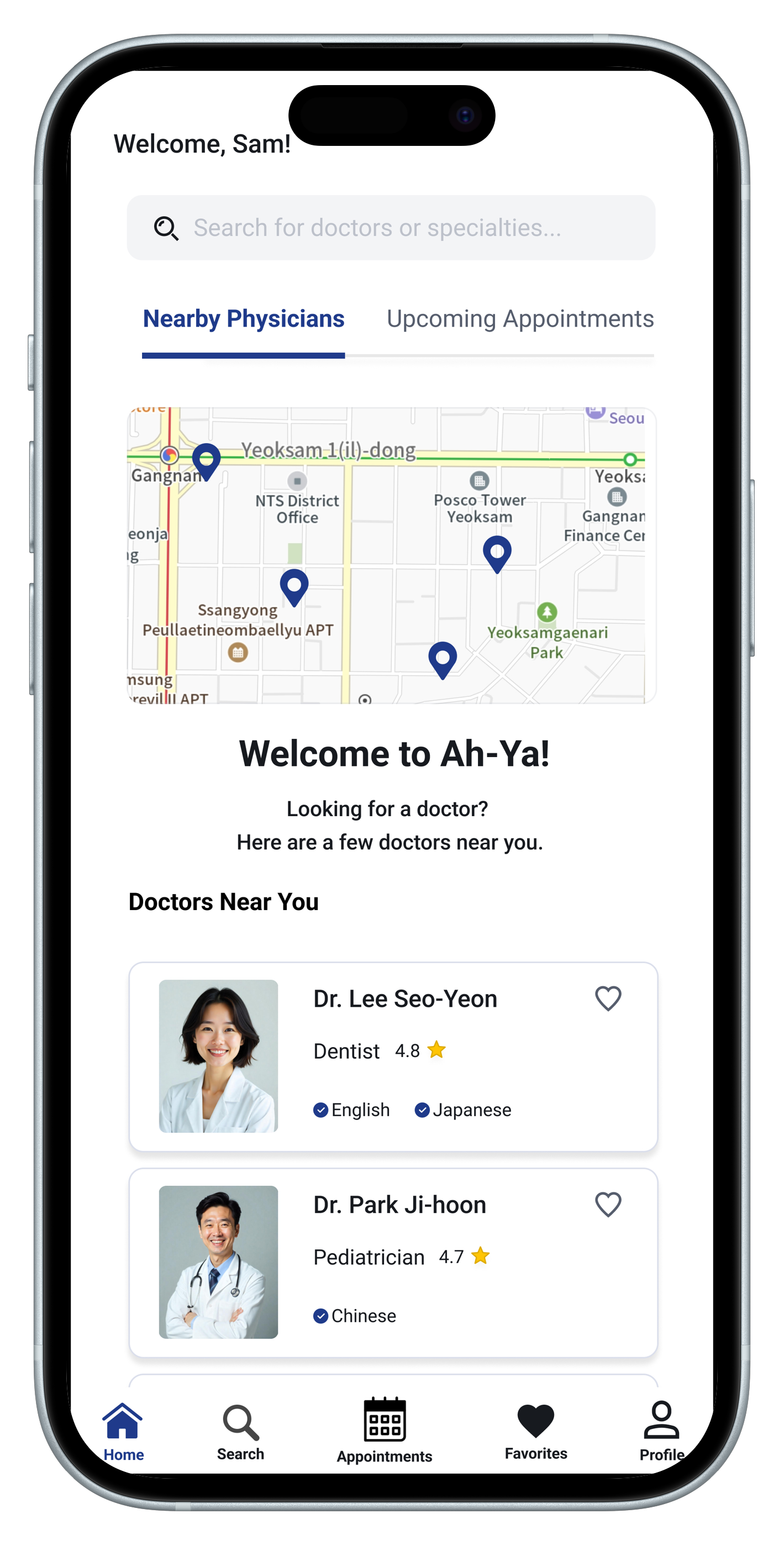
Homepage
A clean and welcoming interface that highlights a map with nearby clinics, a list of recommended doctors, and a search function. Designed to help users quickly find multilingual doctors with minimal effort.
-

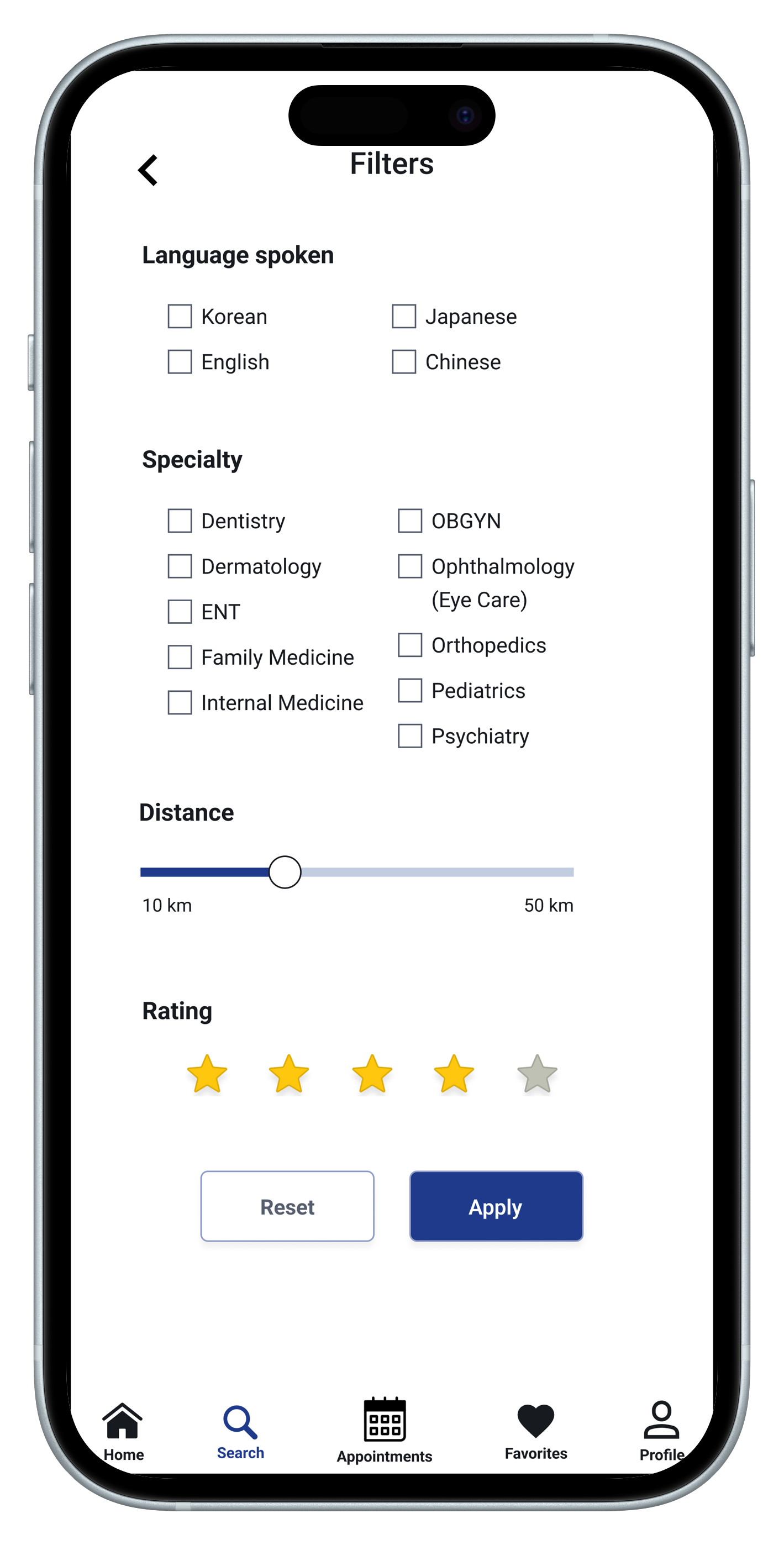
Filter Screen
Language accessibility was a key pain point. This screen allows users to quickly filter doctors based on language preferences (e.g., English, Chinese, Japanese) and specialty.
-

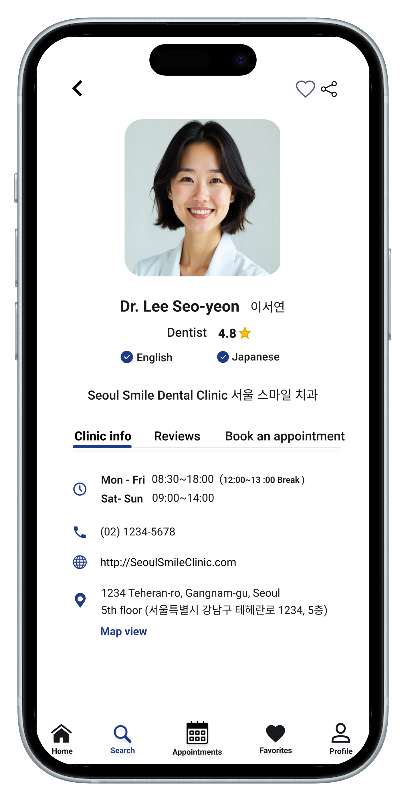
Doctor Profile
The profile screen provides essential information such as the doctor’s language abilities, clinic hours, address, and patient reviews.
-

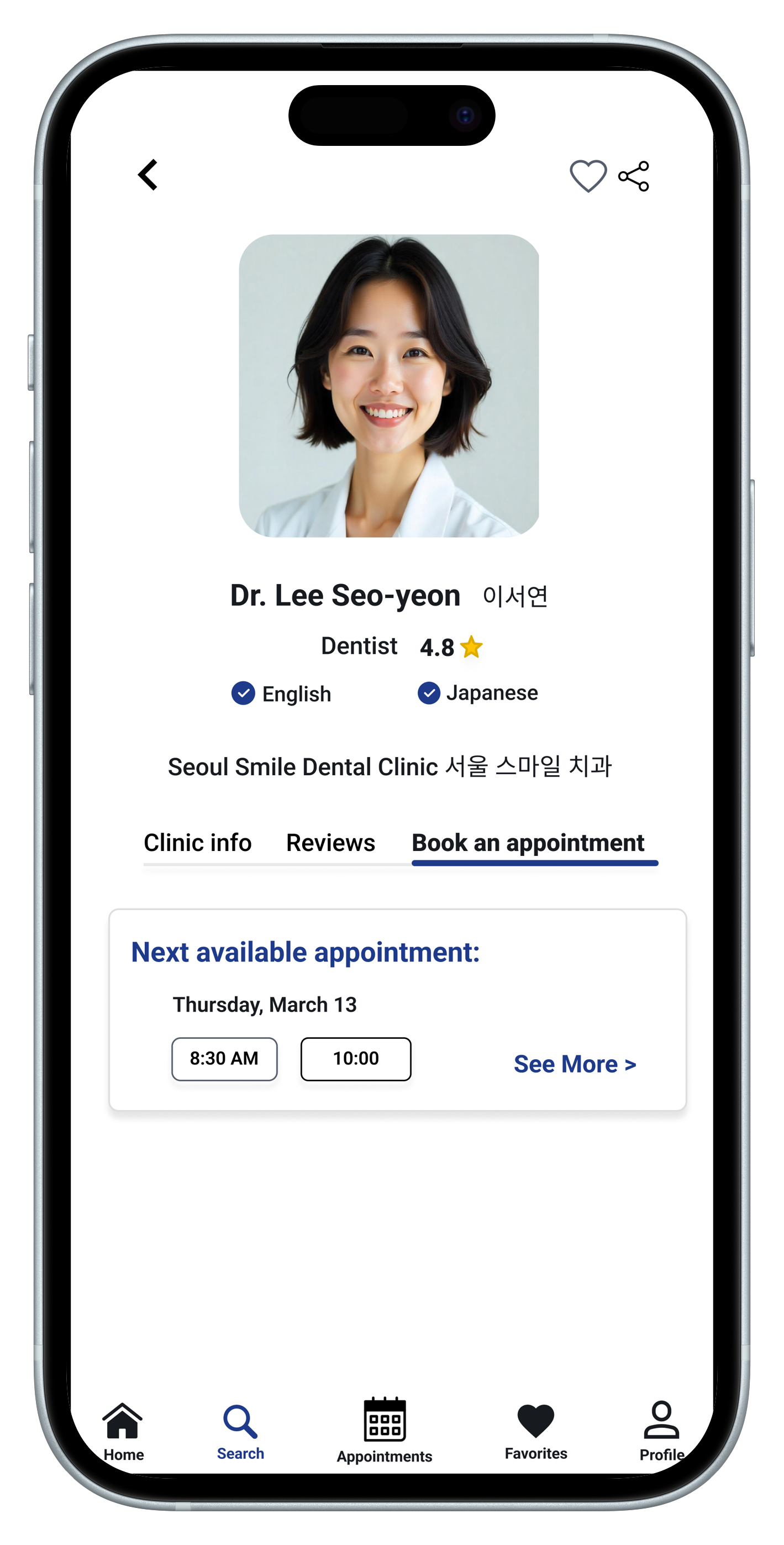
Appointment Booking
I explored a simplified booking flow where users can select a time slot without logging in or navigating multiple screens.
-
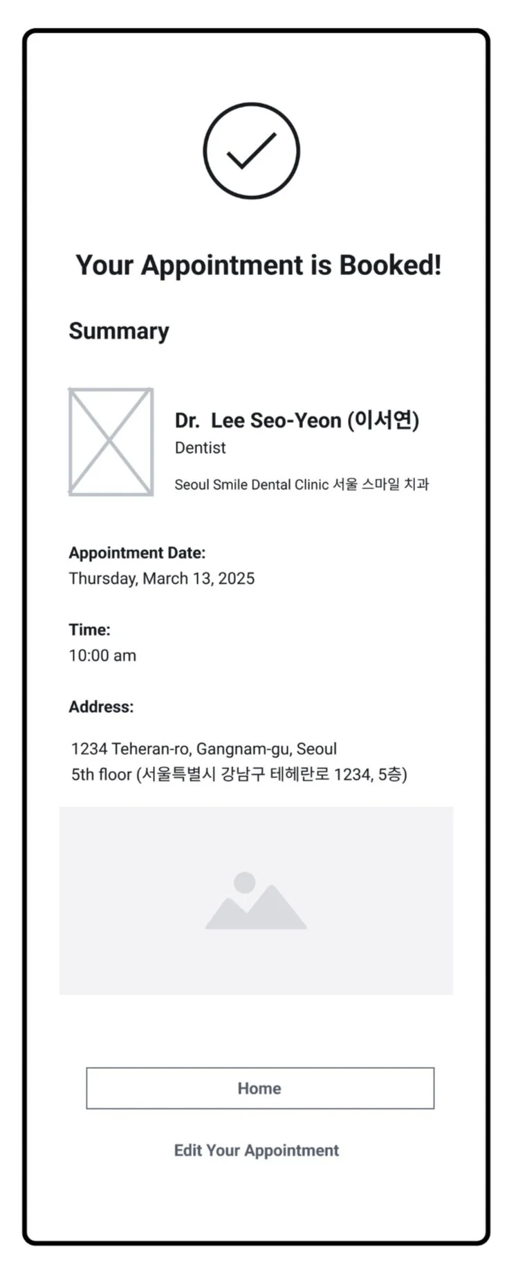
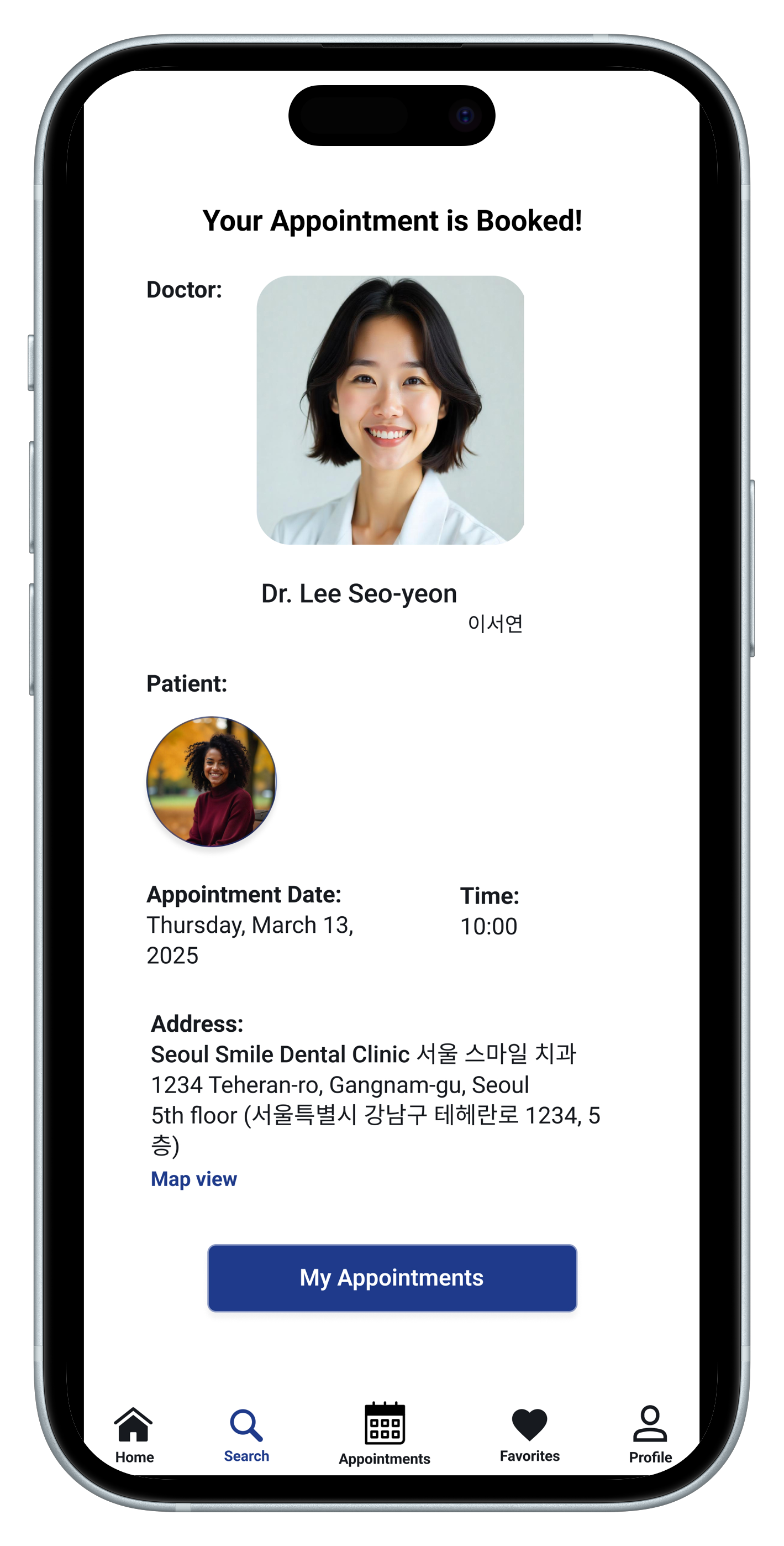
Appointment Confirmation
This screen confirms appointment details and offers the option edit the appointment.
-
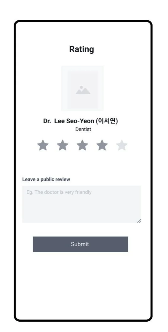
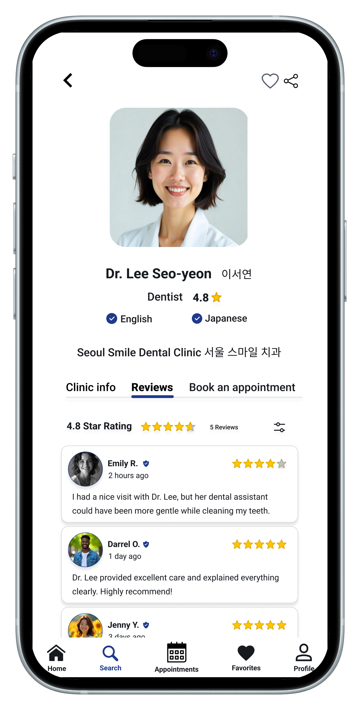
User Review
After their visit, users are encouraged to leave a review to help future patients. The simple layout encourages quick, honest feedback and builds community trust.
Usability Testing & Iteration Summary
During initial feedback sessions on the lo-fi wireframes, users highlighted the need for greater clarity, flexibility, and family-oriented features. Based on these insights, several key improvements were made:
Dependent Management was added to the user profile to support users booking appointments for family members or partners.
The Homepage was redesigned to include a map view, enabling users to quickly locate nearby doctors based on their location.
The Doctor Profile layout was restructured into clearly labeled tabs (Info, Reviews, Appointments) to reduce clutter and enhance usability.
The Booking Flow was updated with a section to select who the appointment is for—making the process more inclusive and user-centric.
High-Fidelity Design
After validating features through low-fidelity testing, I created high-fidelity mockups in Figma that reflect a clean, accessible, and multilingual user experience. The UI was designed to feel calm and intuitive for users navigating healthcare in a second language. These final designs prioritize clarity, usability, and empathy—making healthcare more approachable for foreigners in South Korea.
Key updates include:
A map-integrated homepage for finding nearby doctors.
Tabbed doctor profiles to reduce cognitive load.
A refined booking flow that includes selecting dependents.
A dependent management screen supporting families and partners.
Click on the link to view my prototype: Ah-Ya Hi-Fi


Usability Testing Summary
Overview
I conducted a usability study with users to evaluate the functionality, clarity, and overall user satisfaction of the Ah-Ya.
Key Findings
Users found the app intuitive and easy to navigate.
The language filter feature was especially appreciated.
Most participants could complete key tasks such as booking an appointment without guidance.
Some users found the booking page slightly cluttered and misaligned.
A few users were unsure if the app covered clinics outside of Seoul.
Impact
Based on this feedback:
I will refine the booking page layout for better visual balance.
Over 85% of participants said they would use and recommend the app, showing strong validation of the concept.
Final Reflection
Designing Ah-Ya taught me how critical empathy and accessibility are when creating healthcare solutions for multilingual users. Through user research, iterative design, and usability testing, I crafted a product that addressed real pain points faced by foreigners in Korea.
This case study strengthened my skills in:
Conducting user-centered research
Translating feedback into meaningful design decisions
Balancing simplicity and functionality for diverse audiences
Ultimately, this project reminded me that thoughtful design has the power to build trust and ease in moments that matter — like finding the right doctor when you're far from home.